Labels

Friday, April 6, 2012

Future Seahawks Green Uniforms?

It's a little sloppy, I know, but Just thought I'd put this together really quickly.
It'd be a snazzy look, and I hope they get around to wearing it at some point.

Makes me wish they had done these right when they wore green in 2009. Colored numbers makes them look so much better.

Tuesday, April 3, 2012

New Hawks revealed, judgement yet to come

Before looking at anything else, watch the video below. I know most of the people coming to my blog have seen the new duds on other sites, but take a look at that clip on NFL.COM before taking another look at the kits.


So, I haven't really formed a full opinion on these. I've got a few aspects I REALLY like, and some I'm merely lukewarm on.

By the way, pictures get bigger if you click on them, just in case you want a closer look.

HELMET:


The feathering on the front is a nice touch. It's not too garish yet still brings something unique. The helmets are probably the one spot where I unequivocally love the replacement of the lighter blue in favor of "Seahawks Navy". Do I regret they didn't go with silver helmets? Sure. But I'm more than satisfied with the final result.
The logo didn't connect in the back of the old helmets, which I always felt was a missed opportunity. They do now, and it's a much more cohesive look. And the addition of "Seattle" to the bottom of the helmet is also a positive addition. I still feel green on the bottom stripe of the logo is a missed opportunity, and it's especially evident here. A splash of green in the back would have (I hate this phrase, but...) brought the thing together.
One complaint: the feathering from the front comes to a point right above where the Seahawks logos meet, creating something of a mullet look. Might have been good to fade that pattern out on the way back so that it doesn't stand out so much in the back.

More after the break

Monday, April 2, 2012

Seahawks new Unis to be revealed tomorrow, might look something like this


The picture above is a mockup that has been posted in numerous Seahawks spots over the last few days. If Seattle's new uniforms look like this, I'll be pretty satisfied. I'm still rather unhappy at the missed opportunity to add green to the lower stripe as dictated in this post, but anything resembling the threads above would make up for it. Marshawn will look good streaking up the sidelines in these.

Sunday, April 1, 2012

Zakuani 2 Pole?

If someone were interested in making this for themselves, I'd be delighted. I might try my hand at it myself some time.

For those not in the know, the disembodied head below is that of a Zaku. And like Seattle's lightning fast midfielder, Zakus can be rebuilt and repaired, stronger than ever.

Cascadia + Sounders + Chrome


Use Chrome? Love Sounders? Then check out this sweet theme! You're welcome.

Zakuani hits the pitch in reserve match


Best birthday present ever.

I'd be utterly shocked if it happened, but maybe Zakuani can come in for just a minute or two against Colorado, only a week from the anniversary of his horrific "accident".

MdKathon Via Sounder@Heart

In which I create a new, better Hawks logo.


Courtesy of SgtSasquatch over at Field Gulls, this appears to be the final result. It's awfully plain without the lighter blue (I'm hearing it was scrapped because Reebok owns "Seahawks Blue". Blueshit(sic)). and I could see myself frequently mistaking it for black and white in low lighting, but I don't hate it as much as I did when the concept was first leaked. Still, it really makes one pine for the old Hawks colors.

So I did a little photoshopping and came up with a few new schemes that I like far more than what we seem to be getting. Thats right Mike Williams, I don't care how "ish" the new kits are!

First is the logo we've become accustomed to over the last decade.

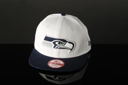
I like the "serious Hawk" but I've never been one for so much white, and the addition of grey like in the hat picture above makes the logo nearly colorless, save for the eye. 

Now the following would have probably been the easiest, slickest fix the Seahawks could have performed, taking the wildly popular green and returning it to where it was in the original "Native Hawk" logo. 
It replaces the Seahawks blue while still keeping some semblance of color in the logo. 
This is the new Hawks logo in the old Hawks colors, and it's a pretty nifty look if I do say so myself. The retrieval of Seahawks history is one that I believe would be greeted with parades among many of the Hawks faithful. I never liked the navy blue they used anyway. 
Now, to take it a step further...


It's a little jarring at first, I admit, but there are few things I would like more than to return silver to the Hawks color pallete. Silver helmets with the Hawk face on them would be one of the best looks in the NFL. I'm not sure which of the two above variations I like better though.
I think I prefer just the beak to be silver, but this is a nice look as well. 

Is there one you prefer? If so, which?