Courtesy of SgtSasquatch over at Field Gulls, this appears to be the final result. It's awfully plain without the lighter blue (I'm hearing it was scrapped because Reebok owns "Seahawks Blue". Blueshit(sic)). and I could see myself frequently mistaking it for black and white in low lighting, but I don't hate it as much as I did when the concept was first leaked. Still, it really makes one pine for the old Hawks colors.
So I did a little photoshopping and came up with a few new schemes that I like far more than what we seem to be getting. Thats right Mike Williams, I don't care how "ish" the new kits are!
First is the logo we've become accustomed to over the last decade.

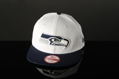
I like the "serious Hawk" but I've never been one for so much white, and the addition of grey like in the hat picture above makes the logo nearly colorless, save for the eye.
Now the following would have probably been the easiest, slickest fix the Seahawks could have performed, taking the wildly popular green and returning it to where it was in the original "Native Hawk" logo.

It replaces the Seahawks blue while still keeping some semblance of color in the logo.

This is the new Hawks logo in the old Hawks colors, and it's a pretty nifty look if I do say so myself. The retrieval of Seahawks history is one that I believe would be greeted with parades among many of the Hawks faithful. I never liked the navy blue they used anyway.
Now, to take it a step further...


It's a little jarring at first, I admit, but there are few things I would like more than to return silver to the Hawks color pallete. Silver helmets with the Hawk face on them would be one of the best looks in the NFL. I'm not sure which of the two above variations I like better though.

I think I prefer just the beak to be silver, but this is a nice look as well.
Is there one you prefer? If so, which?
This comment has been removed by the author.
ReplyDeleteThe dark navy with silver beak and lime green stripe. I prefer contrasting colors and I think the darker protrudes the silver more than the lighter navy.The new logo is solid but a little bland.
ReplyDeleteI agree with you about the contrast, but at the same time, I remember those navy pants the Hawks used to wear occasionally, and I really didn't like those all that much. That said, maybe the new kit design will make the navy/green combo work better.
Delete